Environment: gpt-image-1 via the OpenAI images API, 1024×1024, quality: high, background: transparent. Node.js 20, ImageMagick, HTML/CSS for composition. 116 drawings in the book described here.
A grammar drill book has a strip of illustration above most units: two characters, a gesture each, a line of speech, an arrow between them. It is there to say in one glance what the unit is about before the reader starts reading.
That is roughly a hundred pictures per book, and they have to look like they came from the same pen. Here is the pipeline that got there, and the three constraints that make it work.
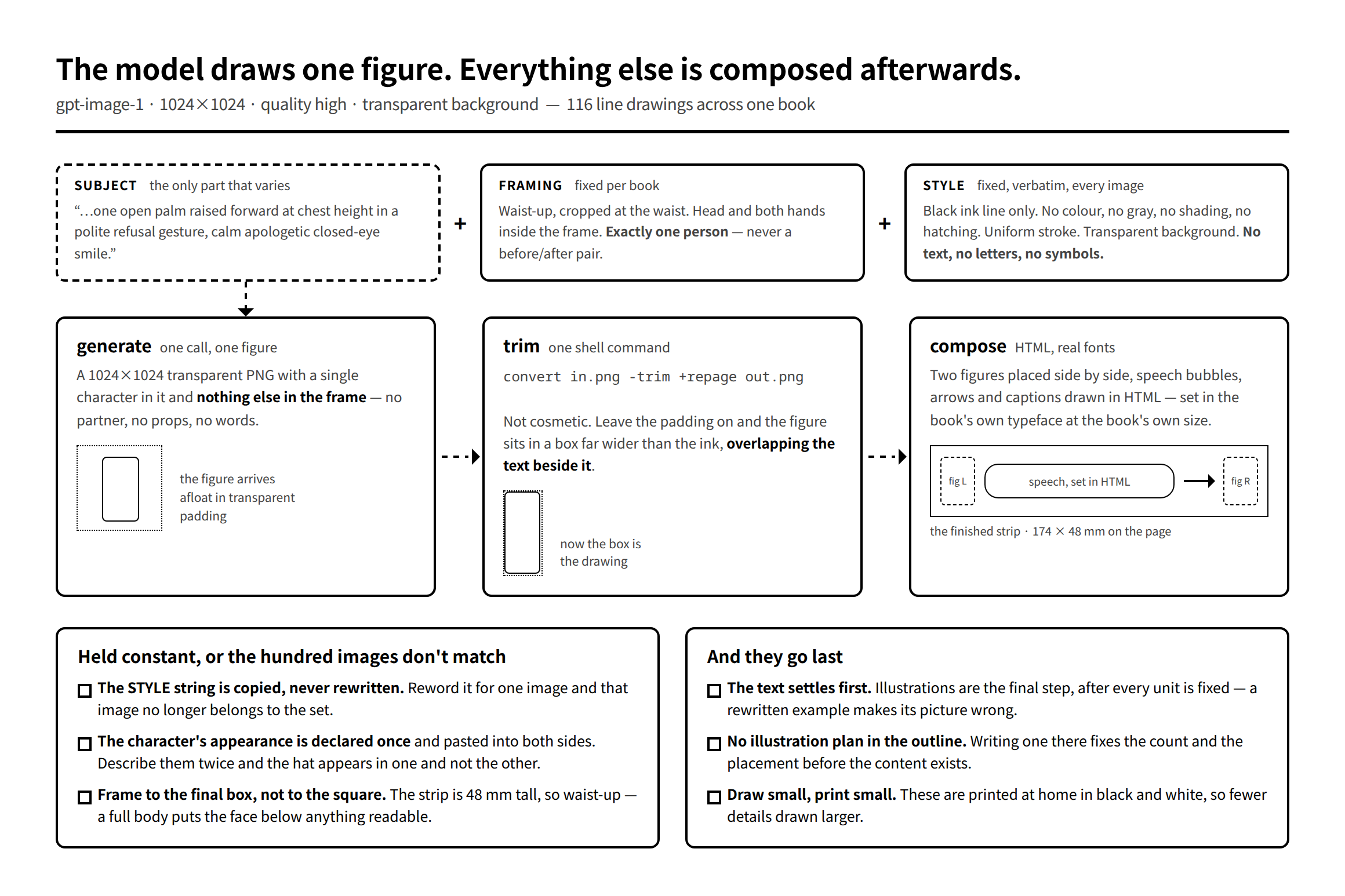
The model draws figures. It does not draw pictures.
The single decision everything else follows from: the model produces one character on a transparent background, and nothing else. No partner, no props, no arrow, and above all no text.
The reason for no text is that Japanese comes out mangled — plausible-looking characters that are not characters. But even in English it would be the wrong place to set type, because the words on the page have to match the book’s typeface at the book’s size. So speech bubbles, captions and arrows are composed afterwards in HTML with real fonts.
The reason for one character per image is subtler and cost us more. Ask for two people in one frame and you get two people who do not look related to each other — and there is no way to fix one of them without regenerating both. Generate them separately and place them side by side, and you can reroll either one alone.
Advertisement
Three strings, one of which varies
Each prompt is concatenated from three pieces:
body: JSON.stringify({
  model: 'gpt-image-1',
  prompt: `${prompt} ${FRAMING} ${STYLE}`,
  size: '1024x1024',
  quality: 'high',
  background: 'transparent',
  output_format: 'png',
  n: 1,
}),
STYLE is what holds a hundred images together, and it is used verbatim, every time:
// 全ユニット共通の描画ルール。ここを変えると絵柄が揃わなくなる。
const STYLE = [
  'Black ink line drawing only. Pure line art, no color, no gray fill, no shading,',
  'no hatching, no gradient. Uniform medium stroke weight, clean confident lines.',
  'Keep the stroke weight and the head size identical to a standard workbook character —',
  'do not zoom in, do not thicken the lines for emphasis.',
  'Transparent background, nothing behind the figure. Absolutely no text, no letters, no speech bubbles, no symbols.',
  ...
].join(' ');
Note what the middle two lines are for. Without them the model interprets an emphatic subject line as a reason to draw emphatically — heavier strokes, a closer crop — and one picture in the set is subtly louder than its neighbours. Style has to be stated as an absolute, not left to be inferred from tone.
The temptation, when one image comes out slightly wrong, is to reword STYLE for that image. Don’t. The moment it is rewritten it describes a different pen, and the image that comes back belongs to a different book. Reroll with the same string, or change the subject line.
FRAMING is fixed per book, and it is derived from the shape of the final box rather than from the square the model draws in:
// 誌面の枠は W174 × H48mm = 横に細長い。全身を入れると 48mm では顔が潰れるので、
// 必ず「腰から上」で描かせる(2026-07-28 実証)。
const FRAMING =
  'Waist-up view only, cropped at the waist. The head and both hands must be fully visible ' +
  'inside the frame with a small margin. Do not draw the legs or feet. Exactly one single person ' +
  'in the image — never two figures, never a before/after pair. No arrows, no motion lines, no symbols...';
174 × 48 mm is a letterbox. A standing full-body figure scaled into 48 mm of height has a face a couple of millimetres across, which on a home inkjet is a grey smudge. So the crop is decided by the page, not by the picture.
The character is described once
Two figures in a strip are usually meant to be the same person in two states — a gesture and a reaction. That only works if they are recognisably the same person.
The way to fail at this is to write each side’s prompt independently. Both descriptions are reasonable, both produce a good drawing, and one of them is wearing a cap:
// 左右で「同じ人物」に見せるため、姿かたちは 1 か所で決めて両方に配る。
// ここを side ごとに書き分けると帽子の有無などがズレて双子に見えなくなる(2026-07-28 実証)。
const PLAIN =
  'A young person. No hat, no cap, nothing on the head. Short simple dark hair, round head, ' +
  'small dot eyes, plain long-sleeved crew-neck top, no apron, no logo.';
Then every subject line for that unit starts with ${PLAIN} and adds only the gesture and the expression. Note how much of that string is negative — "no hat, no cap, nothing on the head". Those clauses are there because the model will otherwise add an accessory as a bit of visual interest, and it will not add the same one twice.
Trim the transparency, or the layout breaks
A transparent PNG from the API is 1024 × 1024 with the figure floating somewhere in the middle. The alpha padding is invisible and takes up space, so a figure placed in a column occupies a box far wider than its ink and shoves — or overlaps — whatever is beside it.
One command, run on every image at generation time:
// compose.py は透明の余白を落とした -t.png を読む。
// 余白を残すと、図が列からはみ出して隣の文字に重なる(2026-07-28 実証)。
execFileSync('convert', [out, '-trim', '+repage', trimmed]);
+repage is the part people forget: -trim alone records the crop as a page offset instead of removing it, and half the tools downstream will faithfully put the padding back.
A transparency trap from the other direction
Not from the model, but from the same folder — worth knowing if your book also contains scanned or extracted figures.
Some PNGs carry colour-key transparency, a tRNS chunk saying "treat pure black as transparent". Word ignores it, so the first edition of a book printed fine. Chromium honours it, so when those same files went through a browser-based typesetter the black knocked out and every line became a white-filled outline.
The check that does not work is counting black pixels: PIL’s convert('L') does not look at tRNS, so a pixel-level test passes cleanly. The checks that do work:
- On the asset:
Image.open(p).info.get('transparency')is notNone. - On the output PDF:
pdfimages -list file.pdfreports ansmaskentry.
The fix is to drop the chunk and leave the pixels alone — do not composite onto white, which turns the black into white.
They go last
The pipeline is cheap enough that it is tempting to start drawing early. Don’t.
Illustrations are the final step, after every unit’s text is fixed. A picture is a commitment to one specific example sentence; edit the sentence and the picture is quietly wrong in a way no check will catch. We also keep illustration plans out of the chapter outlines — writing "five images, one per unit" into a plan fixes the count and the placement before the content that determines them exists, and the next person to read that plan treats it as decided.
The order is: text, then pictures, then layout. The model is fast enough that the last step stays short — which is exactly why it can afford to wait.
Next: selling PDFs directly from your own WordPress with Easy Digital Downloads — where the files live so they can’t be fetched by URL, what the .htaccess has to keep letting through, and how that compares with a platform’s cut.